Study
Azmade Group LLC founded in 2019, has been a candidate to be one of the leading companies in an industrial sector of Azerbaijan. The scale of this company is really impressive: two completely opposite fields of activity - food industry and construction, including dozens of large companies and brands. The company already had a logo, but it did not suit the management for various reasons: poor design, thoughtlessness, lack of uniqueness. Our task was to develop a new identity for the company, which would meet the demand for a national identity, reflect the combination of the two directions of the company and better reflect the high level and scale of Azmade Group.

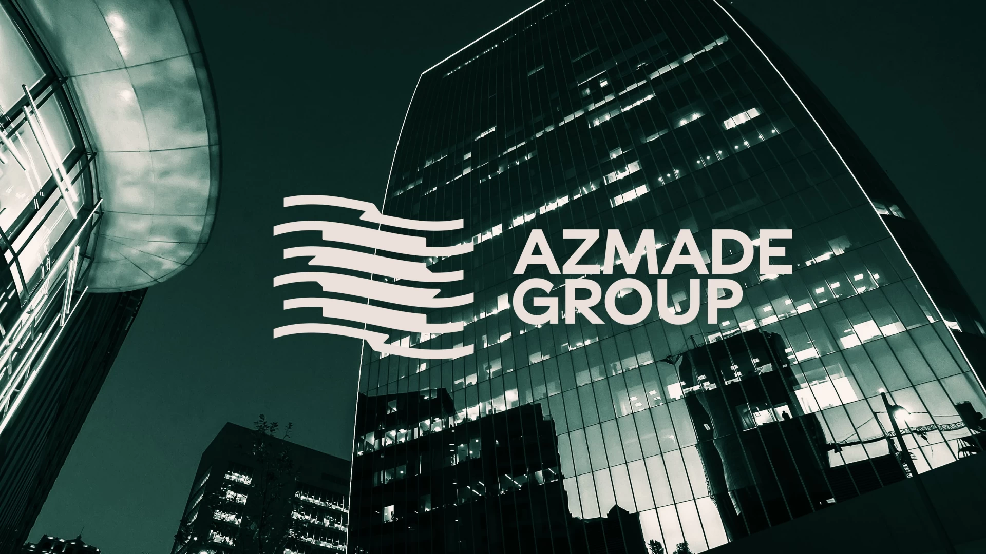
Result
From the very beginning of the project, we wanted to effectively express the balance in the logo with which the company successfully operates two opposing currents of industry. As a result, it resulted in the lines flowing into a single stream from two opposite sides, forming an eight-pointed star in the negative space, responsible for the national identity. We are extremely proud of this last element, because the question was how to reflect Azerbaijan without being trite and fresh, so that it would look natural and not forced. The visual reminder of the flag was also a strong visual solution in positioning the status of Azmade Group. Bold is now spelled out in its entirety, creating a visual balance to the logo without the old-fashioned play with the thickness of fonts. The colors create a sense of prestige and at the same time also respond to the concept of the two currents of the campaign.